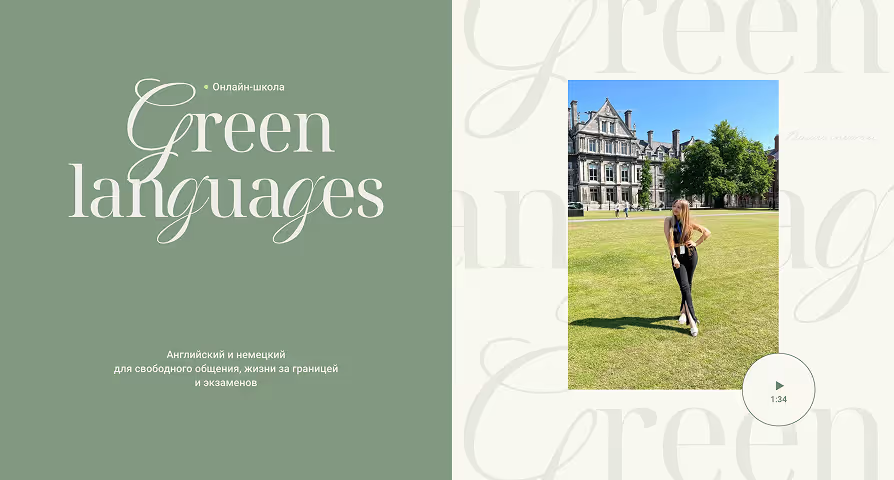
This was not our first time working with Daiana. We had previously created a landing page for one of her courses, and since then, her business had grown significantly. Transitioning from an independent tutor, Daiana established an online school for English and German language learning.
This time, the scope was much broader. We needed a comprehensive multi-page website featuring various learning tracks for each language: exam preparation, speaking clubs, and full programs from beginner to C1 level.
The website aimed to answer prospective students' key questions (catering to learners aged 4 to 57!) before their first call and inspire them with positive energy, making the transition from "I'm interested" to "I'm enrolling" feel warm and welcoming.
( Task)
Create a multi-page website that introduces all learning tracks and tells a story of how to learn a language without giving up halfway due to a lack of motivation.
call
I managed this end-to-end project independently. First, Daiana and I had a call to discuss all the updates and evolution within the school.
During the call, we discussed the tutors, students, and teaching philosophy, highlighting that success is a 50/50 collaboration: the tutor provides knowledge and support, while the student brings dedication and engagement.
Analysis
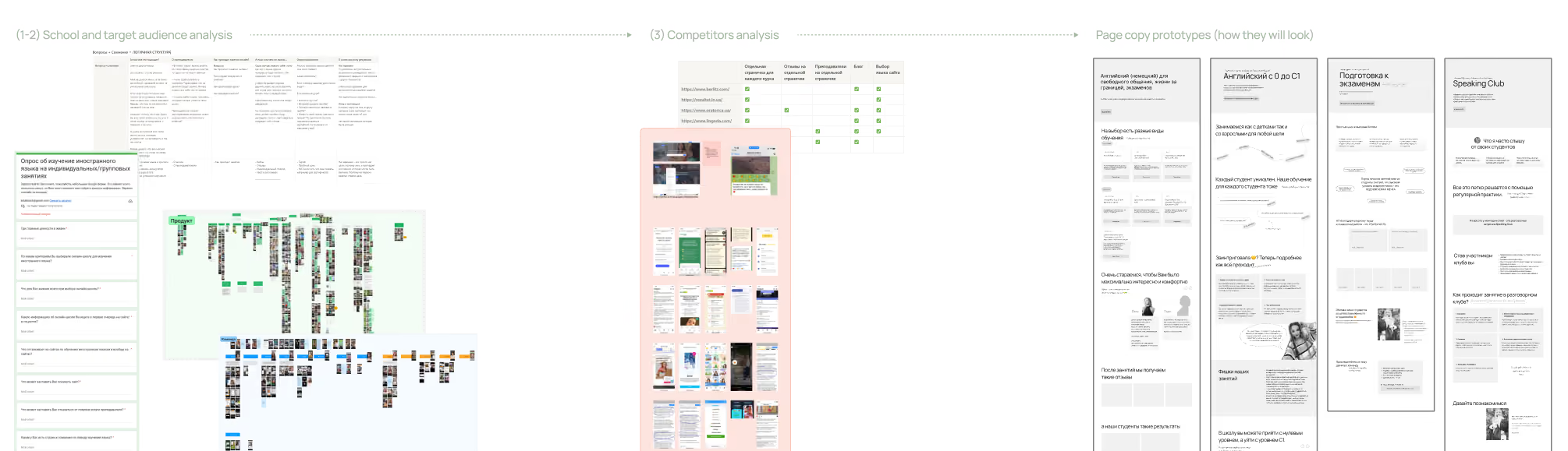
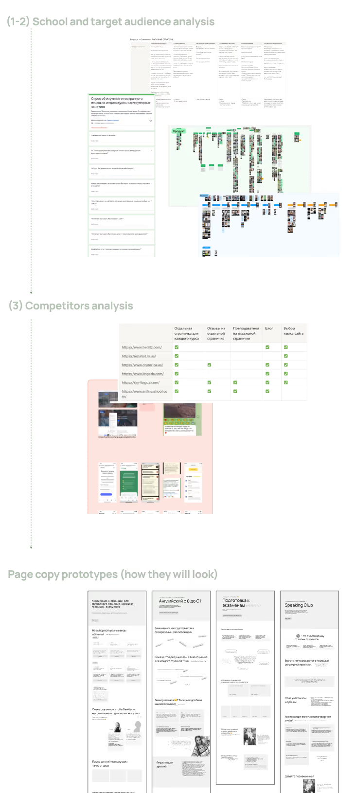
To effectively present each learning track, I first needed to understand the current students. To achieve this, I conducted research across three areas:
(1) School
I explored the school's Instagram, focusing on Daiana's communication style, explanations, and student features. It quickly became clear that the school's key strength lies in real student achievements presented through detailed case studies.
(2) Target Audience
Next, I analyzed the audience. Daiana sent out surveys to her students, which I thoroughly reviewed to build a comprehensive summary table covering likes, dislikes, goals, doubts, and expectations. This process revealed our key insights.
(3) Competitors
Following that, I analyzed competitors. The goal was not to copy existing solutions, but to gain deeper audience understanding and identify proven strategies.
Текст
Student feedback gradually revealed which stories should be told on each page.
It was crucial for the website copy to reflect Daiana's authentic voice. Drawing from audience analysis and the school's Instagram, I compiled key phrases, refined the messaging, and captured the right tone of voice.
Once all inner pages were drafted, I structured the main page as a unified entry point connecting all learning tracks.
We then moved to the review phase: I recorded a video walkthrough of the pages, applied the necessary refinements, and finalized the copy.
MOODBOARD
It all started with a single association: the website should inspire a genuine desire to sit down and study.
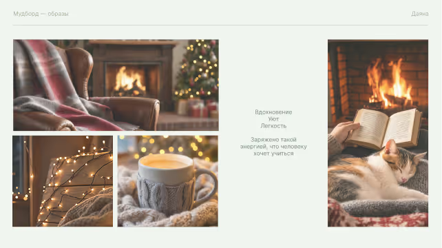
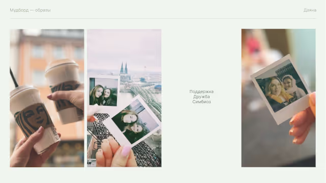
During our initial calls, Daiana mentioned she wanted the site to convey the cozy aesthetic of Pinterest—warm blankets, hot cocoa, laptops, and books. Seeing those visuals instantly makes you want to open a textbook and study. This concept formed the foundation of our moodboard.
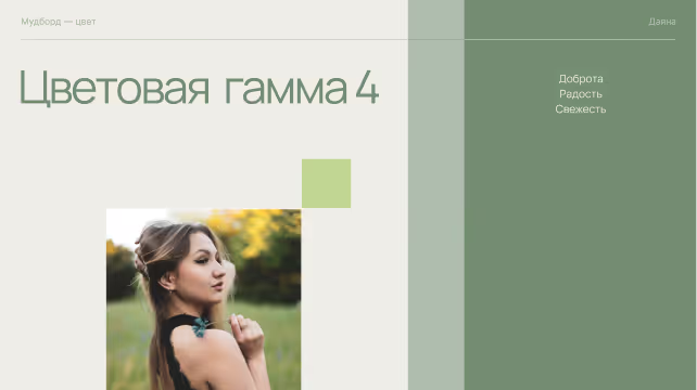
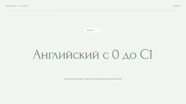
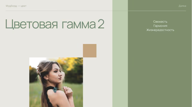
I created a presentation with curated imagery, concepts, and web references to demonstrate how warmth, inspiration, and motivation could be translated into design.
A few slides from the design presentation prepared for Daiana →
I believe in involving clients directly in the creative process so they can choose solutions that truly resonate with them.
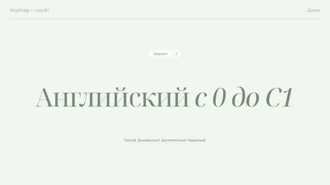
I prepared multiple color and typography options. Green was the natural primary choice, aligned with the school's name, Green Languages, and Instagram presence. However, green can convey different moods—from warm and cozy to fresh, light, or grounded and confident.
The same applied to typography. I presented several typeface options and explained the atmosphere each one creates.
It is always fascinating to see which direction a client chooses!
DESIGN
I then built the visual experience through details: typography, photography, animations, and subtle design choices.
(1) Visual Foundation
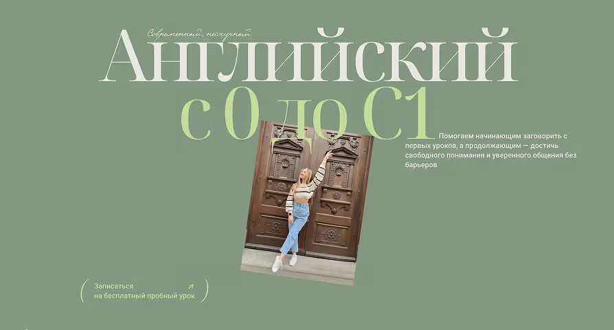
Daiana selected the Noto Serif font, which balances softness with a sense of reliability. Among various green shades, we chose mint green to bring lightness and freshness to the site.
(2) Open Notebook Concept
The notebook and iPad metaphors from our moodboard were integrated into the layout, designing this section like an open page with space for headings, margin notes, and key accents.
(3) Storytelling Through Photography
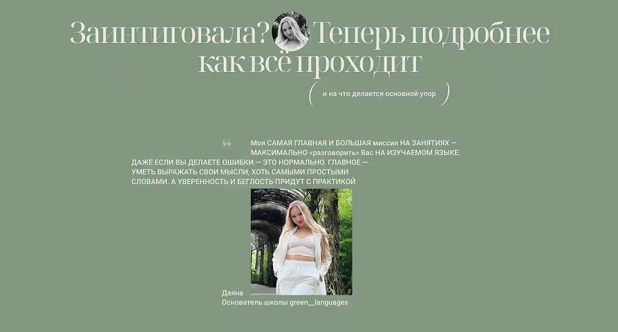
Daiana's Instagram features authentic moments and personal connection. To reflect this on the website, her photos were seamlessly integrated across various pages rather than restricted to a single "About" section.
(4) Interactive Card Stacking
To add dynamism to the student case studies, cards were designed with subtle layering to evoke the feel of turning pages.
(5) Cozy Typographic Accents
An accent typeface was chosen for the letter "G" in "Green Languages". Its smooth curves resemble fireplace flames, adding another subtle reference to warmth and coziness.
(6) Smooth Card Hover Effect
For the study format cards, I configured a gentle hover animation with a subtle delay. The color transition smoothly wraps around the card like a blanket, enhancing the overall cozy feel.
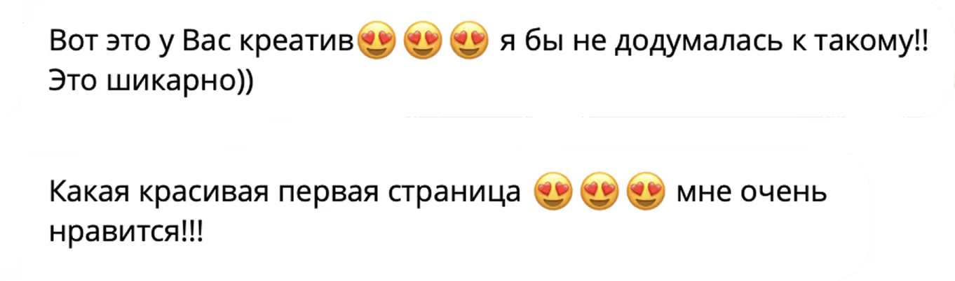
And then came Daiana's first reactions to the design
Все страницы
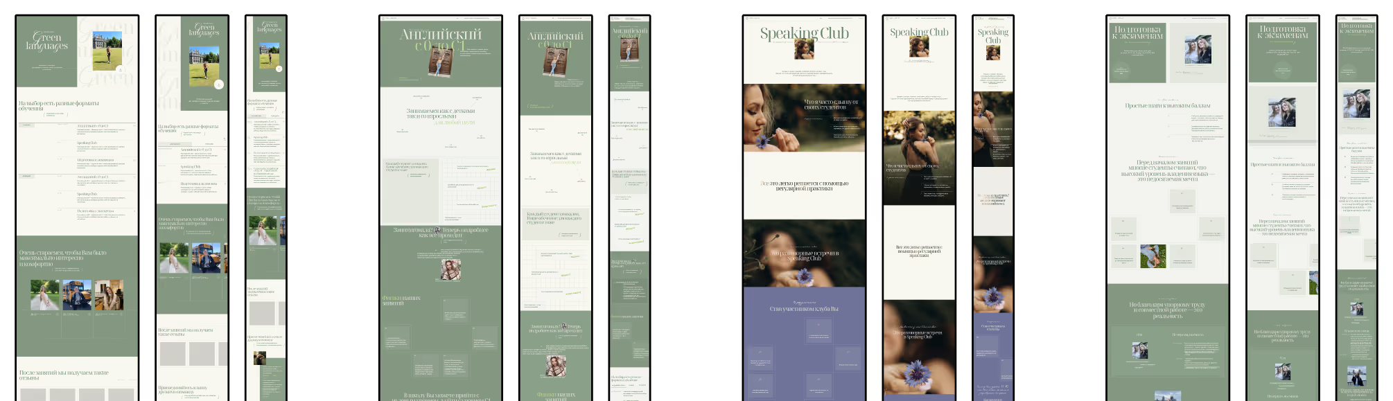
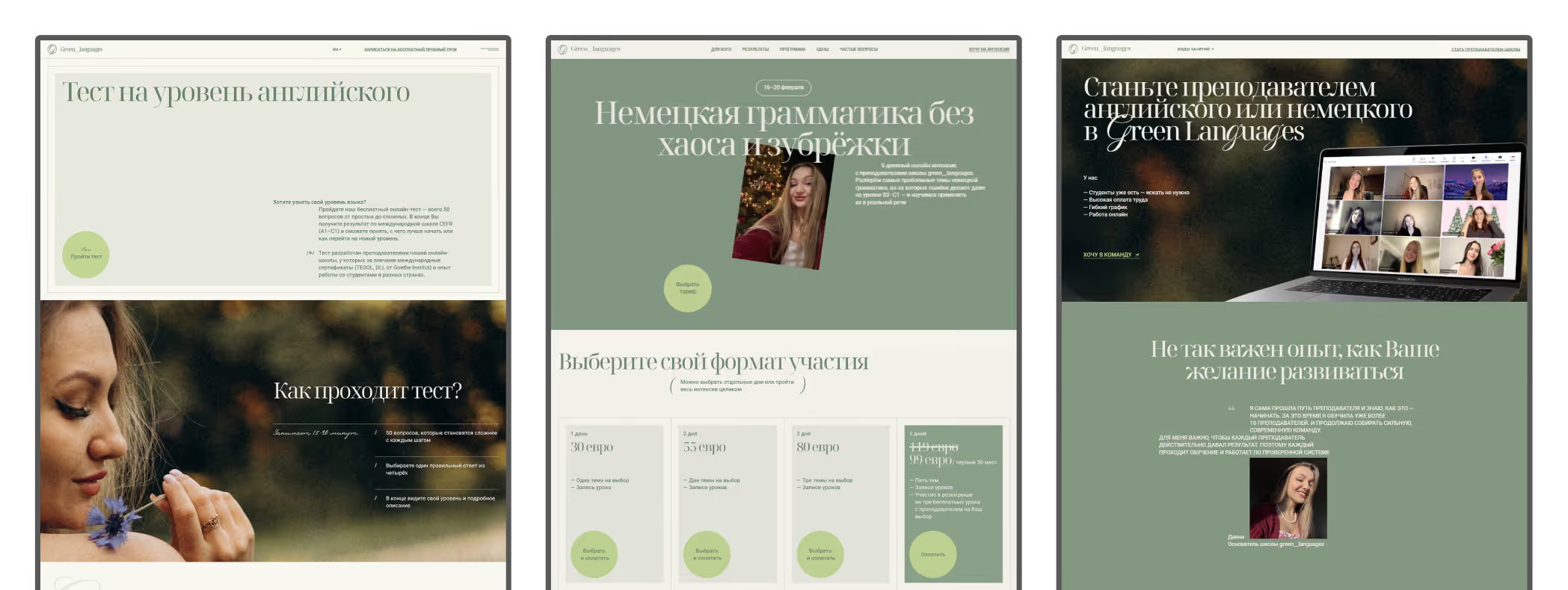
Gradually, the complete website layout came together.
Page by page, I developed the main page, beginner to C1 learning programs, exam preparation, and the speaking club. Every page was fully responsive to ensure a seamless visual experience across desktop, tablet, and mobile devices.
It's moments like these that make me love this part of the job so much
Website handover
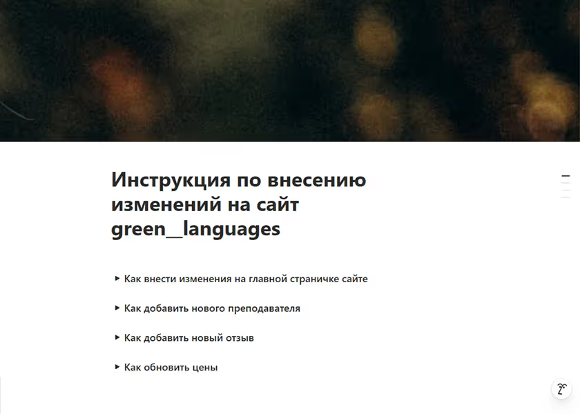
To empower Daiana to manage the site confidently, I provided both written guidelines and video walkthroughs.
Knowing how overwhelming new software can feel, we held a hands-on session practicing routine tasks: updating tutor profiles, adding testimonials, and managing course start dates.
Using Webflow CMS structure allowed content updates to be made effortlessly in minutes, enabling Daiana to manage site updates independently.
Project Growth
As the school continued to grow, Daiana introduced new ideas, and new pages were gradually added to the website.
First, we launched a language level placement test page. Next, we created a landing page for a German grammar intensive course and automated payments with instant access to a private Telegram channel. By that time, Daiana was providing the structure and copy herself, while I built the new pages using existing design components, expanding them only where needed.
Later, we added a dedicated page for tutors, outlining the school's requirements and allowing candidates to apply for open positions.
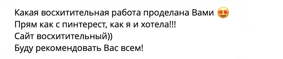
After the project was completed, Daiana shared her thoughts:
00:00 / 00:0016:59
Награды
A few months after the launch, I decided to submit the website to international design competitions for the first time. It ended up winning four awards:
Guru of the DAY
(Web Guru Awards)
(Design Nominees)
Site of The Day
Featured of the Day
(CSSLights)
(Top Design King)
King Of The Day
( P.S )
This project coincided with several courses I was taking in design, Webflow, and AI. Many concepts that feel second nature today were tested here for the very first time. Daiana, thank you so much for your trust and for giving me total creative freedom!
Next case study: "Speaking Club" Coming soon
Этот сайт использует файлы cookie и сервисы веб-аналитики, чтобы анализировать удобство сайта и делать его лучше. Вы можете принять их или настроить под себя. Подробнее — в Политике конфиденциальности